Understanding how color impacts your surroundings can significantly transform your living space into a cohesive and aesthetically pleasing environment. Colors have the inherent power to evoke emotions, influence perceptions, and even affect the overall ambiance of a room. By learning how to harmonize different shades, you can create spaces that not only reflect your personal style but also enhance the functionality and mood of each area in your home.
One important concept in mastering color schemes is the color wheel, which is a visual representation of colors arranged according to their chromatic relationship. Primary colors, including red, blue, and yellow, form the foundation of this wheel. By combining these primary colors, secondary colors such as green, orange, and purple are created. Tertiary colors are a result of mixing primary and secondary colors.
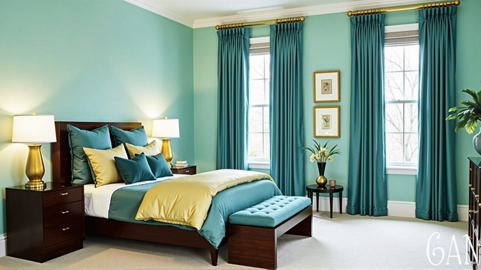
To create a harmonious color scheme, it's crucial to consider different types of color relationships. A monochromatic scheme involves variations in lightness and saturation of a single color, offering a serene and cohesive look. Analogous schemes use colors that are next to each other on the color wheel, providing a sense of unity and comfort. Complementary schemes incorporate colors that are opposite each other on the wheel for a dramatic and vibrant effect, adding exciting contrast to any room.
Considering the emotional and psychological impacts of colors is equally important. Warm colors like reds, oranges, and yellows tend to create energy and excitement, making them ideal for social areas such as living rooms or dining spaces. In contrast, cool colors like blues, greens, and purples usually evoke calmness and relaxation, which can be perfect for bedrooms or bathrooms.
Another critical aspect is understanding how colors react to different light sources. Natural light can alter how colors are perceived throughout the day, while artificial lighting, whether warm or cool, can transform colors entirely during the night. Experimenting with samples and swatches at different times can help in selecting the perfect hue.
Finally, the proportion of each color used within a space is central to achieving balance. The 60-30-10 rule is a timeless guideline: 60% of the space should be a dominant color, 30% a secondary color, and 10% an accent color. This rule ensures a balanced and appealing aesthetic.
By familiarizing yourself with these principles, you can create spaces that not only meet your functional needs but also enhance the overall aesthetic of your home. Harmonizing colors thoughtfully allows for personal expression while crafting a comforting and inviting atmosphere.