The interaction of colors plays a profound role in shaping the ambiance of our homes. Choosing the right hues for your living space can transform not just its look, but also its feel, influencing everything from mood to productivity. Understanding the psychology behind colors can be a powerful tool in creating a space that speaks to your personal taste and fosters the atmosphere you desire.
Embracing the Spectrum of Emotion
Colors are more than just visual stimuli; they evoke emotions and can even influence behavior. Here's a closer look at some popular colors and the psychological responses they elicit:
-
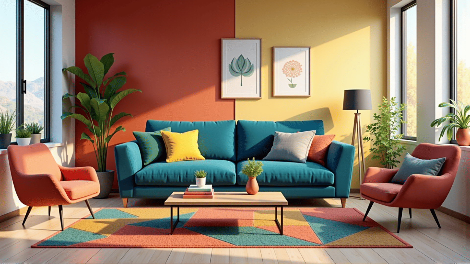
Blue: Often associated with calmness, blue tends to lower heart rates and promote relaxation. It's an ideal choice for bedrooms or spaces where tranquility is desired. Light blues can make a space feel more open, while deeper shades bring a sense of sophistication.
-
Red: Vibrant and attention-grabbing, red can increase energy levels and stimulate conversation, making it an excellent choice for dining areas or social spaces. However, using it in moderation is key, as excessive red can be overwhelming.
-
Green: Symbolizing growth and renewal, green has a soothing effect often linked to nature. It strikes a balance between restful and energizing, serving as a great choice for any room. It is particularly effective in home offices for its ability to foster creativity and focus.
-
Yellow: Often equated with brightness and positivity, yellow can make spaces feel welcoming and friendly. It's fantastic for kitchens and communal areas. Light tones work well to enhance natural light, whereas bold shades can inject energy.
-
Purple: Long associated with luxury and creativity, purple can add depth and richness to a room. Lighter shades like lavender induce calm, making them suitable for bedrooms. Darker tones, on the other hand, offer an air of elegance.
-
White: Evoking simplicity and clarity, white can make spaces appear larger and more open. It provides a versatile backdrop that complements other colors well and can be used to create a minimalist or modern space.
-
Black: While not an everyday choice for larger areas, black can be employed to add drama and sophistication. Used thoughtfully, it can create an elegant and timeless look, especially when paired with contrasting lighter tones.
Creating Cohesive Color Schemes
When selecting color schemes, consider how various hues will interact in a room. One effective approach is using a color wheel to identify complementary colors, which sit opposite each other, such as blue and orange. For a harmonious effect, analogous colors—those next to each other on the wheel, like green and yellow—can be incorporated.
The 60-30-10 rule is another helpful guideline: designate 60% of the room to a dominant color, 30% to a secondary, and 10% to an accent. This method ensures balance and interest without overwhelming the senses.
Personal Touch and Balance
Ultimately, the colors you choose should reflect your personal style and the mood you wish to cultivate. Combining knowledge of color psychology with personal preference can lead to a space that is both aesthetically pleasing and emotionally comforting. Whether you prefer bold strokes or subtle shades, embracing the art of color planning can truly enhance your living environment.